Table of Contents
- eCommerce Product Page Mistakes
- 1. Short Product Descriptions- Missing Key Information
- 2. Duplicate Product Descriptions – A Silent Conversion Killer
- 3. Low-Quality Images – Killing Trust & Conversions
- 4. Not Enough Images from Different Angles
- 5. Lack of Product Videos
- 6. Unclear Product Titles
- 7. Poor Mobile Optimization – Losing Sales from Mobile Shoppers
- 8. Slow Page Load Speed – Killing Conversions Before They Start
- 9. Weak or Missing Call-to-Action (CTA)- – Leaving Sales on the Table
- 10. No Urgency or Scarcity Elements- – Missing Out on Easy Conversions
- 11. Not Using Customer Reviews & Ratings
- 12. Lack of Trust Signals– Making Customers Hesitate
- 13. Unclear or Hidden Pricing-– Creating Friction & Abandonment
- 14. Forgetting to Include Shipping & Return Information and Delivery Date– Leaving Customers in the Dark
- 15. Overwhelming Product Page Layout
- 16. Missing Upsell & Cross-Sell Opportunities – Missing Easy Revenue Opportunities
- 17. Missing Product Offers- – Not Giving Customers a Reason to Buy Now
- 18. No Social Sharing Buttons – Losing Free Marketing Opportunities
- 19. Not Optimizing for SEO – Losing Free Organic Traffic
- 20. Ignoring Schema Markup- – Missing Out on Rich Search Results
- 21. No Live Chat or Customer Support Option
- 22. Not Localizing Content for Different Markets
- 23. Not Tracking & Analyzing Page Performance
- Final Thoughts – Fix These eCommerce Product Page Mistakes & Watch Your Sales Grow!
TABLE OF CONTENTS
Add a header to begin generating the table of contents
Table of Contents
- eCommerce Product Page Mistakes
- 1. Short Product Descriptions- Missing Key Information
- 2. Duplicate Product Descriptions – A Silent Conversion Killer
- 3. Low-Quality Images – Killing Trust & Conversions
- 4. Not Enough Images from Different Angles
- 5. Lack of Product Videos
- 6. Unclear Product Titles
- 7. Poor Mobile Optimization – Losing Sales from Mobile Shoppers
- 8. Slow Page Load Speed – Killing Conversions Before They Start
- 9. Weak or Missing Call-to-Action (CTA)- – Leaving Sales on the Table
- 10. No Urgency or Scarcity Elements- – Missing Out on Easy Conversions
- 11. Not Using Customer Reviews & Ratings
- 12. Lack of Trust Signals– Making Customers Hesitate
- 13. Unclear or Hidden Pricing-– Creating Friction & Abandonment
- 14. Forgetting to Include Shipping & Return Information and Delivery Date– Leaving Customers in the Dark
- 15. Overwhelming Product Page Layout
- 16. Missing Upsell & Cross-Sell Opportunities – Missing Easy Revenue Opportunities
- 17. Missing Product Offers- – Not Giving Customers a Reason to Buy Now
- 18. No Social Sharing Buttons – Losing Free Marketing Opportunities
- 19. Not Optimizing for SEO – Losing Free Organic Traffic
- 20. Ignoring Schema Markup- – Missing Out on Rich Search Results
- 21. No Live Chat or Customer Support Option
- 22. Not Localizing Content for Different Markets
- 23. Not Tracking & Analyzing Page Performance
- Final Thoughts – Fix These eCommerce Product Page Mistakes & Watch Your Sales Grow!
Is your website getting traffic but no sales? Your eCommerce website’s product pages might be the problem.
Your product page is the heart of your eCommerce store. It’s where customers decide to hit “Buy Now” or leave without a second thought.
But many stores on the product pages make these simple yet costly mistakes that drive potential buyers away.
In this post, we’ll cover the most common eCommerce product page mistakes and how to fix them so you stop losing sales and start maximizing revenue.
eCommerce Product Page Mistakes
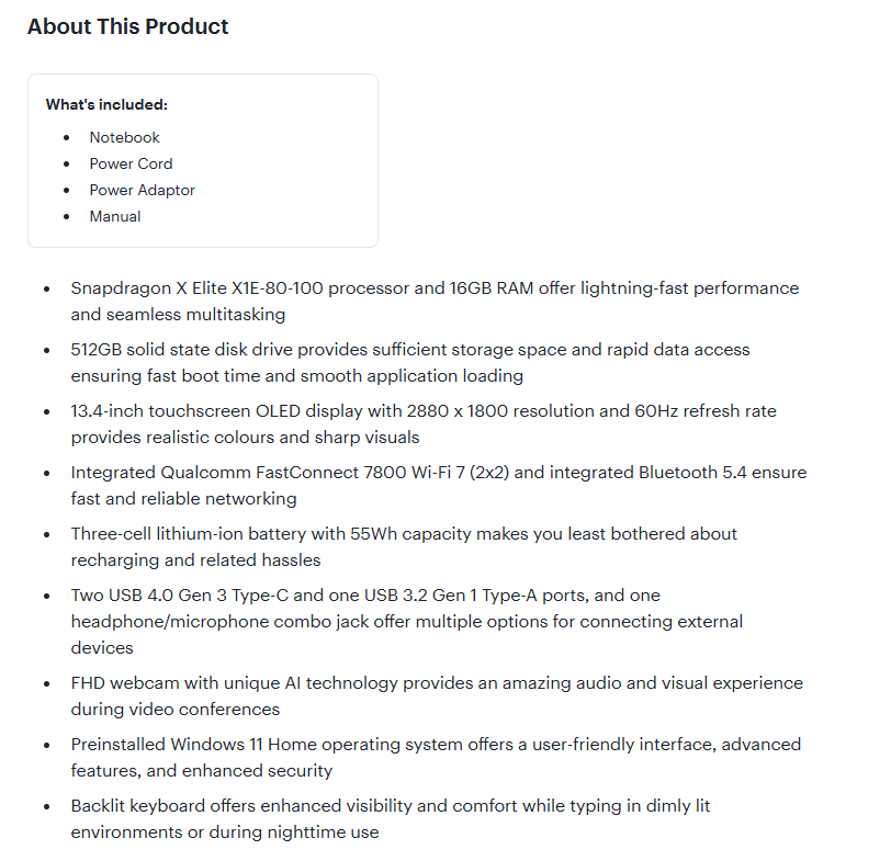
1. Short Product Descriptions- Missing Key Information
A short, vague product description is one of the biggest conversion killers.
Customers need details like size, dimensions, materials, or care instructions before making a purchase, and if your description lacks crucial information, they’ll look elsewhere.
Why It’s a Problem
- Lack of Clarity – Customers may not fully understand what they’re buying.
- Lower Conversions – Unanswered questions lead to hesitation and abandoned carts.
- SEO Disaster – Google favours in-depth, unique content. Thin descriptions mean lower rankings.
- Decreased Customer Trust – Product descriptions without sufficient details may cause customers to perceive the store as unprofessional, negatively affecting brand credibility.
How to Fix It
- Be Descriptive – Cover key product features, benefits, materials, dimensions, and use cases.
- Make It Scannable – Use bullet points, bold key info, and keep paragraphs short.
- Speak to the Customer – Focus on how the product solves a problem or enhances their life.
- Optimize for SEO – Include relevant keywords naturally to improve search visibility.
- Address common customer concerns – Analyze customer queries and reviews to identify missing information and proactively include these details in your descriptions.
The more informative and engaging your product descriptions, the higher your chances of converting visitors into buyers!
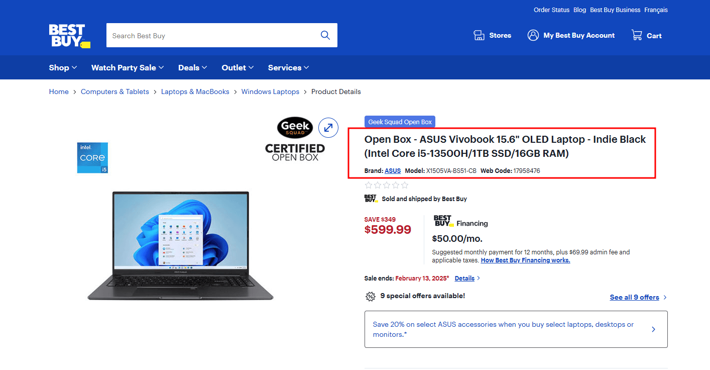
A good example of writing descriptive and engaging product descriptions is Best Buy.

An engaging example of an ecommerce product description
And more information about the product
Another example of engaging ecommerce product description
2. Duplicate Product Descriptions – A Silent Conversion Killer
Copy-pasting the same product description across multiple items might seem like a time-saver, but it’s a costly mistake seen on product pages across thousands of eCommerce websites. Not only does it hurt your store’s credibility, but it also damages your SEO rankings and reduces conversions.
Why It’s a Problem
- Lack of Brand Differentiation: Hundreds of other eCommerce websites may be using identical product descriptions.
- Hurts SEO – Search engines prioritize unique content. Duplicate descriptions can cause ranking drops and lost organic traffic.
- Reduces Trust – Repetitive descriptions make your store look lazy and untrustworthy. Customers may question if your products are actually different.
- Weakens Engagement – Generic descriptions fail to capture each product’s unique selling points (USPs), making them less compelling to buyers.
How to Fix It
- Write Unique Descriptions – Highlight distinct features, benefits, and use cases for each product.
- Focus on What Makes It Different – Even if two products are similar, emphasize variations in material, style, or intended use.
- Use AI or Templates Wisely – If you have a large catalogue, create structured templates but personalize key details for each product.
- Optimize for SEO – Incorporate relevant keywords naturally to improve visibility on search engines.
- Audit and Update Old Descriptions – Keep an eye on supplier updates and regularly review your product pages to identify and replace duplicate/outdated content.
- Leverage Customer Insights – Analyze customer reviews, feedback, and questions to identify key selling points and address common concerns. Incorporating this language into your descriptions can make them more relatable and persuasive.
3. Low-Quality Images – Killing Trust & Conversions
A blurry, pixelated, poorly lit product image can instantly turn potential buyers away.
Why It’s a Problem
- First Impressions Matter- Blurry, pixelated, or poorly lit images give an unprofessional impression, making customers question the product’s quality and the business’s credibility.
- Reduces Conversions – Customers can’t inspect products in person, so unclear images create doubt.
- Increases Returns – Misleading or unclear visuals lead to unmet expectations and unhappy buyers.
- Competitive Disadvantage – You may lose customers to stores that showcase products with professional, high-quality visuals.
How to Fix It
- Use High-Resolution Images – Ensure crisp, clear images that allow customers to zoom in for details.
- Invest in Professional Photography – Good lighting, proper angles, and a clean background make a huge difference.
- Showcase the Product in Use – Lifestyle images help customers visualize the product in real-life scenarios.
- Use Consistent Styling – A uniform background and layout create a professional look across your store.
- Optimize for Web Display – Compress images to reduce loading time while maintaining quality. Using tools like TinyPNG and ImageOptim can help.
A good example of high-quality images with consistent quality on the product pages is OldNavy.

An example of an ecommerce website with high-quality product images
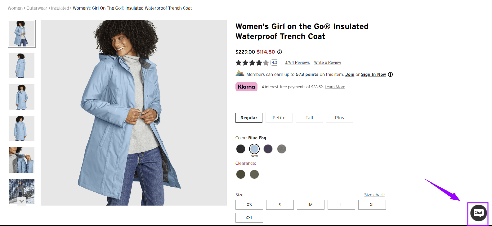
4. Not Enough Images from Different Angles
Providing one or two generic product photos makes it harder for users to trust the product. Missing multiple images from different angles can create hesitation, leading to lost sales.
Why It’s a Problem
- Creates Uncertainty – Customers can’t fully understand the product’s design, texture, or details.
- Increases Return Rate – Buyers may receive the product and realize it’s not what they expected.
- Hurts User Experience and sales – A lack of visual information frustrates shoppers and pushes them to competitors with better images.
How to Fix It
- Capture Multiple Angles – Show front, back, sides, top, bottom, and close-up shots to give a full view.
- Include Zoom & 360° Views – Let customers examine textures, stitching, and details up close.
- Show Size & Scale – Display the product in context (e.g., a backpack on a model or a phone case next to a smartphone).
- Use Lifestyle Images – Show the product in action to help buyers visualize its real-world use.
- Show Functional Features – For products with movable parts or compartments, capture images of these features in action to convey their functionality better.
More angles = more confidence = more conversions. Give your customers the complete picture!
An excellent example of providing product images from different angles is Amazon.
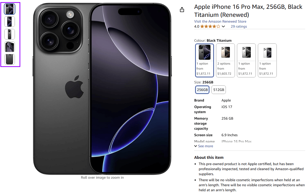
An example of a website screenshot from multiple angles
5. Lack of Product Videos
Images are great, but videos take product visualization to the next level. A well-shot video can show how a product looks, moves, and functions in real life—giving customers the confidence they need to hit “Buy Now.” If your product pages don’t include videos, you’re missing out on a powerful conversion booster.
Why It’s a Problem
- Reduced Engagement – Videos capture attention and keep visitors on the page longer.
- Less Buyer Confidence – Without a video, customers may struggle to understand product functionality or quality.
- Higher Return Rates – Unclear expectations lead to more disappointed buyers and returns.
- Missed Opportunity to Demonstrate Value – Videos allow you to highlight a product’s unique features and benefits more effectively than static images or text.
- Disadvantage Against Competitors – Businesses that include product videos often have higher engagement and conversion rates.
How to Fix It
- Add Demo Videos – Show how the product works, its features, and real-life applications.
- Include 360° Views – Let customers see the product from all angles in motion.
- Use Customer-Generated Videos – User reviews and unboxing videos add authenticity and social proof.
- Keep It Short & Engaging – A 30 to 60-second video is ideal to grab attention and highlight key details.
Here is how Amazon does it.

An example of a website with a product video
6. Unclear Product Titles
Your product title is the first thing customers see, and it plays a crucial role in both user experience and search engine rankings. If your titles are too vague, overly generic, or missing key details, you risk confusing potential buyers and losing visibility in search results.
Why It’s a Problem
- Poor Searchability – A generic title like “Running Shoes” won’t help customers find your product.
- Lowers Click-Through Rates (CTR) – If the title doesn’t immediately communicate value, shoppers may scroll past.
- Hurts SEO Rankings – Search engines rely on keywords; weak titles mean less visibility.
How to Fix It
- Make Titles Descriptive – Include essential details like brand, model, material, colour, and key features.
- Use Keywords Naturally – Optimize for SEO without stuffing keywords awkwardly.
- Keep It Readable – Avoid overly long, cluttered titles that look spammy.
- Highlight the USP— If your product has a standout feature (e.g., waterproof, lightweight, or eco-friendly), mention it.
And BestBuy does it beautifully.
An example of a website with a descriptive and keyword-rich product title
7. Poor Mobile Optimization – Losing Sales from Mobile Shoppers
With over 70% of online shopping happening on mobile devices, a poorly optimized product page that doesn’t load properly, has a bad layout, or requires endless scrolling and zooming can drive potential buyers away in seconds.
Why It’s a Problem
- Frustrates Mobile Users – If buttons are too small, images don’t load correctly, or text is hard to read, users will leave.
- Increases Bounce Rates – A bad mobile experience leads to higher exits and lower conversions.
- Hurts SEO Rankings – Google prioritizes mobile-friendly sites. So, poor optimization can lower your visibility in search results.
- Cart Abandonment – Users are likelier to abandon their carts on websites with clunky checkout processes or those that are difficult to complete on mobile.
How to Fix It
- Use a Responsive Design – Ensure your site adjusts to different screen sizes automatically.
- Optimize Images & Load Speed – Compress images and remove unnecessary scripts to improve performance.
- Optimize Navigation – Optimize menus and search bars to enhance the mobile browsing experience.
- Make CTAs Easily Clickable – The "Add to Cart" and "Buy Now" buttons should be large, prominent, and easy to tap.
- Test on Multiple Devices – Regularly check how your product pages look on different smartphones and tablets.
8. Slow Page Load Speed – Killing Conversions Before They Start
In eCommerce, every second counts. If your product pages take too long to load, potential buyers will leave before even seeing your products. Studies show that a 1-second delay in load time can reduce conversions by up to 7%.
Why It’s a Problem
- High Bounce Rates – Customers won’t wait; they’ll move on to a faster site.
- Lower Search Rankings – Google penalizes slow pages, reducing your organic traffic.
- Poor User Experience – Laggy pages frustrate visitors and decrease engagement.
- Reduced Conversions – Even a one-second delay in page loading can significantly impact conversion rates.
How to Fix It
- Compress Images – Use WebP format and optimize file sizes without sacrificing quality.
- Minimize Unnecessary Apps & Scripts – Too many third-party apps slow down performance.
- Enable Lazy Loading – Load images only as users scroll to save initial load time.
- Use a Content Delivery Network (CDN) – Speeds up load times by serving content from the nearest server with a CDN
- Optimize Theme & Code – Remove excess CSS, JavaScript, and unused features.
- Optimize Server Performance – Consider upgrading to dedicated or cloud-based hosting for better scalability.
9. Weak or Missing Call-to-Action (CTA)- – Leaving Sales on the Table
Your Call-to-Action (CTA) is what turns a browsing visitor into a paying customer. If your CTA is weak, unclear, or missing altogether, you’re making it harder for shoppers to take the next step —resulting in lost conversions.
Why It’s a Problem
- Customers Don’t Know What to Do Next – If the CTA isn’t clear, they won’t take action.
- Reduces Conversions – A weak CTA lowers the likelihood of adding to the cart or checking out.
- Lacks Urgency & Persuasion – A generic button doesn’t encourage immediate action.
How to Fix It
- Make It Clear & Action-Driven – Use strong, specific CTAs like "Add to Cart," "Buy Now," or "Get Yours Today" instead of vague terms.
- Use Eye-Catching Design – The CTA button should stand out with a bold colour and readable font.
- Create a Sense of Urgency – Add phrases like "Limited Stock," "Only 3 left in stock", or "Offer Ends Today" to encourage immediate action.
- Position It Prominently – Ensure the CTA is easy to find, ideally near the product title and price.
Here is how Best Buy uses strong CTA on the product page:
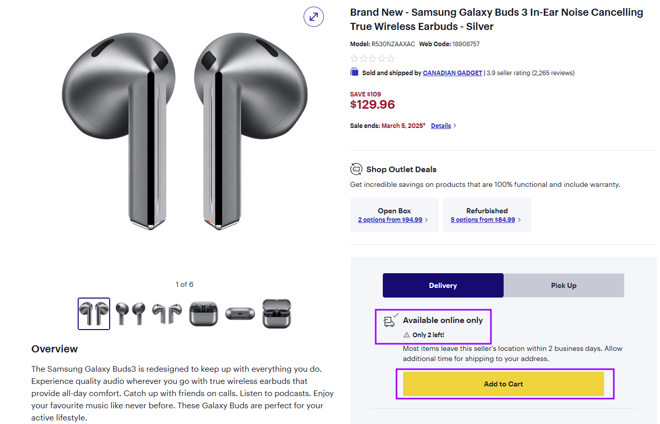
An example of an ecommerce website with effective CTAs
10. No Urgency or Scarcity Elements- – Missing Out on Easy Conversions
Adding urgency (limited-time offers) and scarcity (low-stock alerts) creates psychological triggers that push customers to buy now instead of later.
Why It’s a Problem?
- Reduces Impulse Purchases – Customers feel no reason to act immediately.
- Increases Cart Abandonment – Without urgency, buyers may delay their decision and never return.
- Lower Conversion Rates – Stores that effectively communicate limited-time offers or low-stock availability often see significantly higher conversion rates.
- Missed Sales Opportunities – Competitors using urgency tactics will close the sale first.
How to Fix It?
- Show Stock Levels – Use phrases like "Only 3 Left in Stock!" to encourage quick action.
- Add Countdown Timers – Display timers for limited-time sales, flash deals, or shipping cutoffs
- Highlight Fast Shipping Deadlines – "Order Within 2 Hours for Next-Day Delivery" creates urgency (think of Amazon’s delivery time cut-offs).
- Use Time-Sensitive Discounts – Offer promotions like "20% Off – Ends Tonight!" to create FOMO (Fear of Missing Out).
- Promote Seasonal or Event-Based Discounts – Create urgency around specific events, like “Holiday Sale Ends Soon” or “Back-to-School Special.”
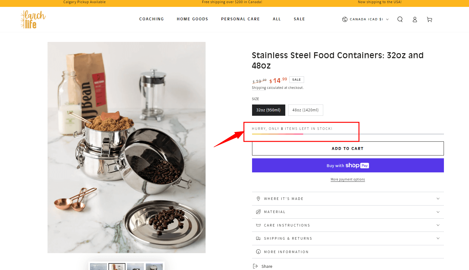
Here is an urgency or scarcity tactic example
11. Not Using Customer Reviews & Ratings
93% of consumers say online reviews influence their purchase decisions. No reviews? That’s a red flag for shoppers.
Why It’s a Problem?
- Reduces Trust – Customers may question the quality or legitimacy of the product.
- Lowers Conversions – Without social proof, potential buyers hesitate.
- Misses SEO Benefits – Google values fresh, user-generated content, and reviews help rankings.
- Fewer Insights for Improvement – Reviews can help identify product issues, inform marketing strategies, and improve customer satisfaction.
How to Fix It?
- Enable & Encourage Reviews – Send follow-up emails asking buyers to leave feedback.
- Show Star Ratings Prominently – A product with 4.5+ stars instantly builds confidence.
- Highlight Verified Purchases – This assures customers that reviews are from real buyers.
- Display UGC (User-Generated Content) – Let customers upload photos/videos with their reviews for added authenticity.
Here’s an excellent example from Gym Shark:
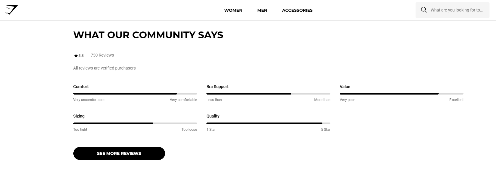
An example of customer reviews & ratings on a product page

Further Reading
For deeper insights into how online reviews shape consumer decisions across industries, we recommend this global research study on buying behavior
12. Lack of Trust Signals– Making Customers Hesitate
Online shoppers are naturally cautious—if they don’t trust your store, they won’t buy. Missing trust signals like security badges, guarantees, or clear return policies can make customers feel uneasy, leading to abandoned carts. People need reassurance before they hand over their credit card details.
Why It’s a Problem?
- Creates Doubt – Customers might question if your store is legit.
- Increases Cart Abandonment – Customers are increasingly aware of online fraud. If they don’t feel secure, they won’t complete the purchase.
- Hurts Credibility – A lack of trust signals makes your store look unprofessional.
How to Fix It?
- Display Security Badges – Show SSL certificates and payment security icons (Visa, Mastercard, PayPal, etc.).
- Highlight Money-Back Guarantees – A "30-Day Hassle-Free Return Policy" removes buyer risk (if applicable)
- Make Contact Information Clear – Offer live chat, email, and phone support options.
- Showcase Customer Service & Policies – Clearly state refund policies, delivery estimates, and support details.
- Place trust signals such as “Secure Checkout 100% Buyer Protection", "Fast & Free Returns – No Hassle, No Worries," and/or "Trusted by 10,000+ Happy Customers" near the "Add to Cart" button.
Amazon has all the vital information close to the “add to bag” button to make it super easy for customers to find answers for delivery speed, cost, and return information.

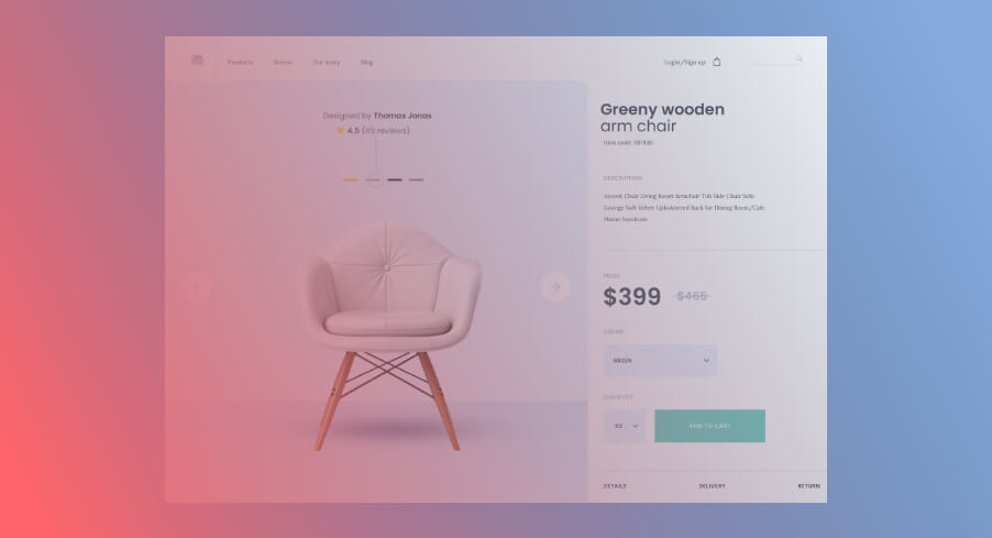
13. Unclear or Hidden Pricing-– Creating Friction & Abandonment
Nothing frustrates online shoppers more than unclear, hidden, or hard-to-find pricing. If customers have to hunt for the price, go through multiple clicks, or reach checkout just to see the final cost, they’ll leave—fast. Transparent pricing is crucial for building trust and reducing friction in the buying process.
Why It’s a Problem?
- Creates Frustration – Customers expect immediate clarity on product costs.
- Increases Cart Abandonment – Unexpected fees or hidden charges can make them back out.
- Hurts Trust & Credibility – Lack of transparency makes your store seem unreliable.
How to Fix It?
- Display Pricing Clearly – Show the full price upfront, with no hidden surprises.
- Break Down Additional Costs – If applicable, include taxes, shipping and any other fees (for example, import fees), and discounts upfront, such as "$49.99 – Free Shipping on Orders Over $50."
- Use Strikethroughs for Discounts – Show original and sale prices to highlight savings.
- Be Transparent About Payment Options – Clearly mention installments, financing, or "Buy Now, Pay Later" options.
- Offer Price Breakdown – For products with optional add-ons or customization, provide a detailed price breakdown so customers understand what they're paying for.
And Temu has done it excellently.
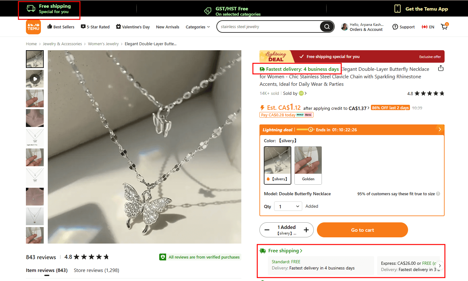
An example of a product page with clear details for shipping and delivery time
14. Forgetting to Include Shipping & Return Information and Delivery Date– Leaving Customers in the Dark
Offering clear and transparent shipping, return, and delivery information reduces friction, builds customer confidence, and significantly improves the shopping experience.
Why It’s a Problem?
- Creates Uncertainty: Customers may be unsure about shipping costs, delivery times, or how to handle returns.
- Increases Cart Abandonment: Unexpected shipping fees or unclear return policies can deter customers from completing their purchases.
- Damages Trust: Lack of transparency can make your store appear unprofessional or unreliable.
How to Fix It?
- Clearly Display Shipping Costs: Provide detailed information about shipping fees, including any thresholds for free shipping.
- Outline Delivery Times: Inform customers about estimated delivery times for different regions or shipping methods.
- Detail Return Policies: Clearly explain the process for returns, including timeframes, conditions, and any associated costs.
- Make Information Easily Accessible: Place links to shipping and return policies in prominent locations, such as the product page, footer, and during the checkout process.
Wayfair excels in providing clear shipping and return information.

An example of a product page with clear details for shipping, returns and delivery time
15. Overwhelming Product Page Layout
A cluttered, disorganized product page overwhelms customers and makes it harder for them to focus on what matters—the product itself.
Why It’s a Problem?
- Distracts from the Purchase Decision – If the page is chaotic, customers may struggle to find key details.
- Slows Down the Buying Process – A confusing layout makes it harder for users to navigate and take action.
- Hurts Mobile Experience – Overstuffed pages look even worse on small screens, causing higher bounce rates.
- Decision Paralysis – Too much information presented all at once can cause decision fatigue, leading customers to abandon the page.
How to Fix It?
- Use a Clean, Organized Design – Keep the layout simple with plenty of white space to improve readability.
- Prioritize Key Information – Make product images, title, price, CTA (Add to Cart), and key specs easily visible.
- Minimize Distractions – Avoid excessive banners, pop-ups, or unrelated links that take focus away from the product.
- Optimize for Mobile Users – Ensure content scales properly and remains easy to navigate on smaller screens.
- Organize with Tabs or Accordion Menus – Break down detailed information like product specs, FAQs, and shipping details into collapsible sections to reduce visual clutter.
A good example of a beautifully done, uncluttered product page is FHENY.

An example of an uncluttered product page
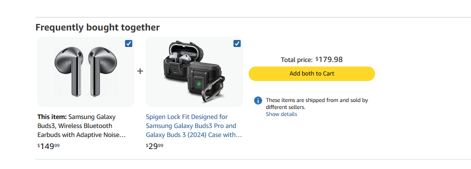
16. Missing Upsell & Cross-Sell Opportunities – Missing Easy Revenue Opportunities
If you’re not suggesting complementary or upgraded products on your product pages, you’re missing a huge chance to increase average order value (AOV) and maximize revenue.
Why It’s a Problem?
- Lower AOV – Customers may buy just one item when they might be interested in more.
- Missed Revenue Opportunities – If you don’t suggest relevant products, customers won’t know about them.
- Competitors Benefit Instead – Shoppers might look elsewhere for related products instead of buying from you.
How to Fix It?
- Use "Frequently Bought Together" Sections – Show related products or add-ons that enhance the main item like Amazon does it on the product page.
- Suggest Upgrades (Upselling) – Offer premium versions, larger sizes, or higher-end models such as "Upgrade to the Pro Version – Better Sound & Longer Battery Life."
- Offer Bundle Discounts – Encourage multiple purchases with “Buy More, Save More” deals such as "Get 10% Off When You Buy 2 or More!"
- Personalize Recommendations – Use AI-powered suggestions based on browsing or purchase history.
17. Missing Product Offers- – Not Giving Customers a Reason to Buy Now
If your product pages lack special offers, discounts, or value-driven promotions, you’re making it harder for customers to commit to a purchase.
Why It’s a Problem?
- Reduces Conversions – No offers = no extra motivation to buy now.
- Increases Cart Abandonment – Customers may delay purchasing if there’s no urgency.
- Lowers Average Order Value (AOV) – Without incentives, shoppers buy less.
How to Fix It?
- Run Limited-Time Discounts – Offer “10% Off Today Only” or “Buy 2, Get 1 Free” promotions.

- Highlight Free Shipping Thresholds – Encourage bigger orders with “Free Shipping on Orders Over $150.”
- Loyalty & First-Time Buyer Discounts – Offer special pricing for returning customers or new visitors.
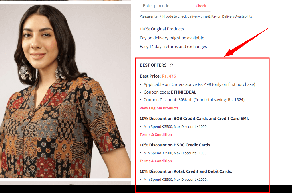
- Display Best offers, coupons, or offers with credit cards, as brilliantly done by Myntra.
18. No Social Sharing Buttons – Losing Free Marketing Opportunities
With a social sharing option on the product page, you empower your customers to become brand ambassadors, driving organic traffic and boosting brand visibility at no additional cost.
Why It’s a Problem?
- Missed Free Marketing – Without social share buttons, you lose the chance to tap into organic word-of-mouth marketing.
- Lowers Brand Reach – Customers can’t easily share products they love.
- Misses Out on Viral Marketing – Social sharing can introduce your brand to hundreds or thousands of potential buyers.
- Reduces Social Proof – Seeing a product shared by friends builds trust and interest.
How to Fix It?
- Add Social Share Buttons – Include share options for Facebook, Instagram, Twitter, Pinterest, and WhatsApp.
- Make Sharing Seamless – Buttons should be visible and easy to use on both desktop and mobile.
- Encourage Sharing with Incentives – Offer a discount or giveaway for customers who share your products by adding “Share & Get 10% Off” buttons next to the “Add to Cart” option
- Leverage UGC (User-Generated Content) – Display customer-shared photos and reviews to inspire more engagement.

19. Not Optimizing for SEO – Losing Free Organic Traffic
Without SEO-optimized product pages, you’re making it harder for potential customers to find you. By prioritizing SEO, you boost your store’s visibility, drive sustainable organic traffic, and reduce dependence on costly paid marketing strategies. Search engine optimization (SEO) isn’t just for blogs—it’s essential for eCommerce. The right SEO strategy can boost your rankings, increase organic traffic, and drive more sales without spending on ads.
Why It’s a Problem?
- Lower Search Rankings – If your product pages don’t appear in search results, you’re missing potential customers.
- Less Organic Traffic – Without SEO, you rely too much on paid ads for visitors.
- Higher Dependence on Paid Ads – Without SEO, you’ll have to rely more heavily on costly advertising campaigns to attract visitors.
- Competitive Disadvantage – Your competitors with optimized pages will outrank you.
How to Fix It?
- Conduct Keyword Research – Identify and target relevant keywords that your customers use when searching for your products using tools like Google Keyword Planner or Ahrefs.
- Optimize Product Titles & Descriptions – Use high-ranking keywords naturally in the product title and description.
Example: Instead of a generic product title like “Men’s Sneakers,” use:
“Men’s Lightweight Running Shoes – Breathable, Shock-Absorbing Sole” (Keyword Optimized)
- Add Unique, Keyword-Rich Meta Descriptions – Helps improve click-through rates (CTR).
Example: “Shop the Best Running Shoes for Comfort & Performance” (Meta Description for Better CTR)
- Use Alt Text for Images – Descriptive alt text boosts image search rankings.
- Include Schema Markup – Helps Google display rich snippets (price, ratings, availability) on Google search results page
- Improve Page Speed – Faster load times improve SEO and user experience.
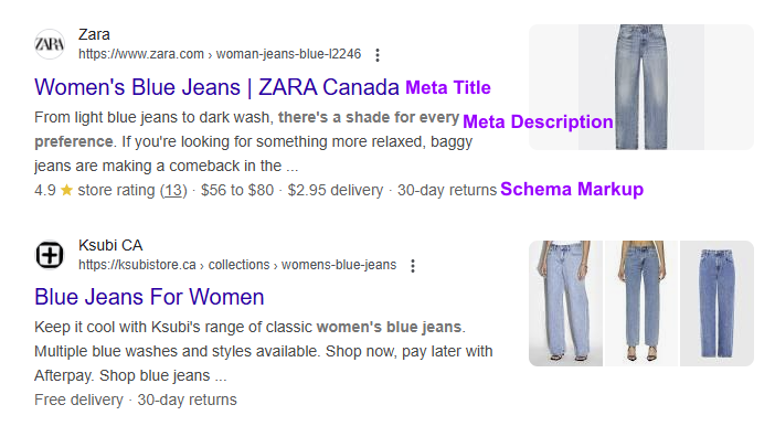
20. Ignoring Schema Markup- – Missing Out on Rich Search Results
If you’re not using schema markup on your product pages, you’re making it harder for search engines to display important product details in search results. Schema markup helps Google show rich snippets like price, availability, ratings, and reviews, making your listing stand out and attract more clicks.
Why It’s a Problem?
- Lower Click-Through Rates (CTR) – Listings without rich snippets look less appealing.
- Missed SEO Advantages – Google prioritizes structured data for better search rankings.
- Less Customer Engagement – Shoppers are drawn to search results that show product details upfront.
How to Fix It?
- Use Product Schema Markup – Add structured data for price, availability, brand, and SKU.
- Include Review & Rating Schema – Helps display star ratings in search results for more credibility.
- Mark Up Breadcrumbs – Improves navigation in search results.
- Test with Google’s Rich Results Tool – Ensure your markup is correctly implemented.
An example of a rich snippet-optimized result: Adidas

21. No Live Chat or Customer Support Option
Delayed Response = Lost Customer
Shoppers often have last-minute questions before making a purchase. If your product page lacks a live chat or easy customer support option, customers may leave without buying—simply because they couldn’t get a quick answer.
Why It’s a Problem?
- Increases Cart Abandonment – Last-minute unanswered questions about shipping, returns, product specs, or payment options lead to hesitation and abandonment.
- Reduces Customer Trust – A lack of support makes your store seem unreliable.
- Missed Sales Opportunities – A quick response could have turned visitors into buyers.
How to Fix It?
- Enable Live Chat – Offer real-time support via chat widgets like Shopify Inbox, Tidio, or Gorgias.
- Use AI Chatbots for Instant Replies – Automate responses for common questions (shipping, returns, sizing, etc.).
- Provide Multiple Support Channels – Display email, phone, and FAQ links prominently.
- Offer 24/7 or Business Hour Availability – Let customers know when they can expect a response.
See how Eddie Bauer does it:
22. Not Localizing Content for Different Markets
If your eCommerce store sells globally but doesn’t tailor content for different regions, you’re creating unnecessary friction for potential buyers. Currency, language, and region-specific details matter—and failing to localize can result in lost conversions.
Why It’s a Problem?
- Confuses International Customers – Prices in an unfamiliar currency, conversion markups, or untranslated text make it harder to buy.
- Increases Cart Abandonment – If shipping options, taxes, or payment methods aren’t clear, shoppers may leave.
- Hurts User Experience & Trust – Customers feel more comfortable buying from a store that speaks their language and understands their needs.
How to Fix It?
- Offer Multi-Currency Support – Use automatic currency conversion or display local pricing like for "🇫🇷 Buy in Euros (€) | 🇯🇵 Yen (¥) | 🇦🇺 AUD ($)
- Translate Product Pages – Use localized language options for better engagement.
- Adapt Payment Methods – Enable region-specific payment options like PayPal, Klarna, or local bank transfers.
- Show Country-Specific Shipping & Taxes – Be upfront about delivery timeframes, import duties, and Tax.
23. Not Tracking & Analyzing Page Performance
If you don’t track the performance of your product pages, you cannot know what’s working and what’s not. Data-driven decisions are key to optimizing conversions, improving user experience, and increasing revenue. Without analytics, you’re just guessing
Why It’s a Problem?
- You Can’t Identify What’s Working (or Failing) – Without tracking, you have no insight into which product pages convert well and which are underperforming.
- Missed Opportunities for Optimization – Slow load speeds, poor CTA placement, or weak descriptions might cost you sales—but without data, you won’t know.
- Wasted Marketing Spend – If paid traffic isn’t converting, without data, you might be throwing money at the wrong problem.
How to Fix It?
- Use Google Analytics & Heatmaps – Track visitor behaviour, bounce rates, clicks, scroll, and conversion funnels.
- Set Up Event Tracking – Measure clicks on "Add to Cart," scroll depth, and CTA interactions.
- A/B Test Key Elements – Experiment with pricing, CTA buttons, images, and descriptions to see what converts best.
- Monitor Mobile vs. Desktop Performance – Ensure both experiences are optimized.
- Regularly Review & Adjust – Make data-backed optimizations instead of relying on assumptions.
Final Thoughts – Fix These eCommerce Product Page Mistakes & Watch Your Sales Grow!
Your product page is the make-or-break point of your eCommerce store. Even with great products and strong marketing, simple product page mistakes, as mentioned above, can silently kill conversions. The good news? Every issue covered in this list is fixable.
So, here’s your next move: Audit your product pages today. Fix these common mistakes, track your results, and watch the impact on your conversions. The sooner you optimize, the faster you’ll see results.
Need expert help in optimizing your store? Let’s make your product pages conversion-ready!